How to choose fonts for your brand (plus my top 5 favorite font pairings)

I have had a love for typography ever since I first started learning design almost 20 years ago! I love how a font can invoke a feeling or portray a certain style. Good fonts can absolutely elevate your brand and take it from basic to beautiful!
With so many fonts available (and more being created every day!) how do you know where to start when choosing your brand typography?
I’m sharing my personal process for picking perfect fonts. (How’s that for a tongue twister??)
Start by defining your brand personality.
Before diving into the world of fonts, or just picking one that you like the look of, you need to start by defining your brand personality. Your fonts will need to match your brand style in order to have the effect you desire.
If you’re not sure where to start when it comes to defining your brand, this blog post will help!
Once you’re clear on what you want your brand to convey, you can choose a few key words that sum of what your brand personality or style is all about.
For example, you might want a brand that feels inviting, nurturing and feminine, or you might want a brand that is bright, fun and playful. Defining your brand personality like this will help you with the next steps, which is actually finding fonts that convey that feeling!
Choosing fonts for your brand
Although there’s no hard and fast rules to choosing brand typography, there is a formula that I personally follow when choosing fonts:
One signature font (showcases your brand personality)
One heading font (compliments your brand style & has high contrast)
One paragraph font (compliments your brand style & is easy to read)
Within your selection of fonts, you can use variations of each font for more flexibility. For example, most fonts come in various weights (ie. bold) as well as an italic version. You can get even more flexibility by manipulating the spacing between letters (tracking) or using upper case. Rarely do you need more than three fonts. (In fact, sometimes two is enough!)
If your signature font is easy to read, it can be used for headings and your second font could be used for subheadings. However, if your signature font is hard to read, then use it sparingly as a design element and use variations of the heading font for both headings and subheadings.
Choosing fonts with personality
Now that you know how many fonts to look for, how do you choose the right font for each purpose?
Your signature font is used to set the tone for your brand, so that’s where I usually start. Try searching “brand keyword + font” or “Display font” on Pinterest, Creative Market or something like Font Squirrel for some inspiration.
As you browse fonts, ask yourself, how the font makes you feel. Then check in to see if it matches the keywords you set as your brand personality.
Here are a few examples:
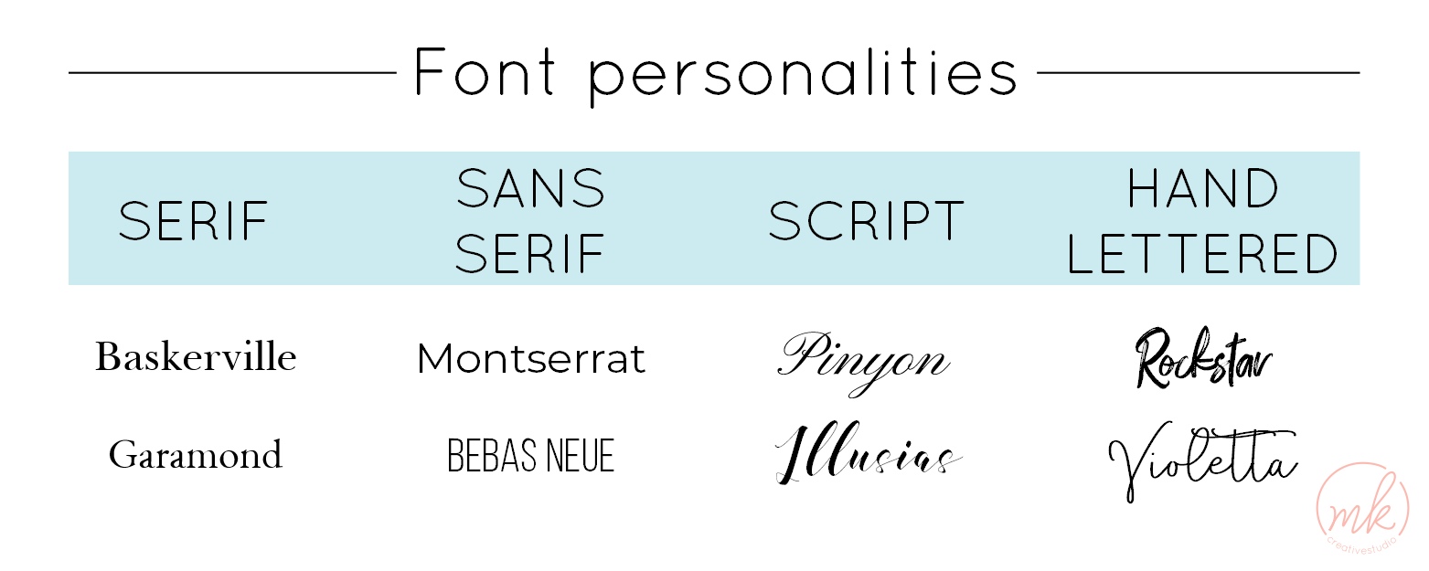
Typically, serif fonts like Baskerville lend a classic, sophisticated feel, while sans serif fonts like Montserrat feel more modern and clean. Script fonts can tend to feel luxurious or feminine, while hand lettered fonts can feel approachable, creative or playful.
There’s a lot of variation within each font style, so pay attention to the way the font makes you feel.
After choosing your signature font, you can move on to choosing your heading and paragraph fonts. Choose fonts that complement your signature font, give you the same feeling, but don’t conflict visually.
Here are some tips for choosing complimentary fonts:
Pair a simple, clean font with an intricate display font
Mix and match serif and sans serif fonts, rather than using two of the same style
Use a clean, easy-to-read font for your body font
When in doubt use variations of the same font
Keep it simple!
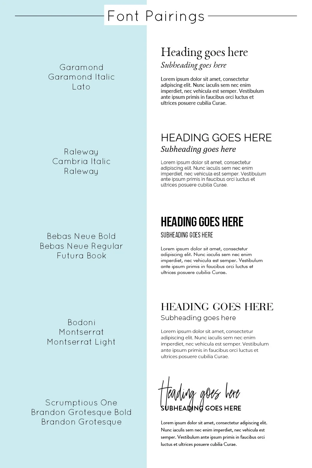
Font pairing inspiration
To give you some ideas, I’ve put together some of my favorite font pairings! Feel free to take inspiration from these brand pairings for your own brand!